Commercial Bank of Dubai
Commercial Bank of Dubai (CBD) is one of the UAE’s leading financial institutions. Working as part of the design team at Omnia, I led the redesign of CBD’s payment and transfer flows while contributing to the overall visual direction.
Product Design
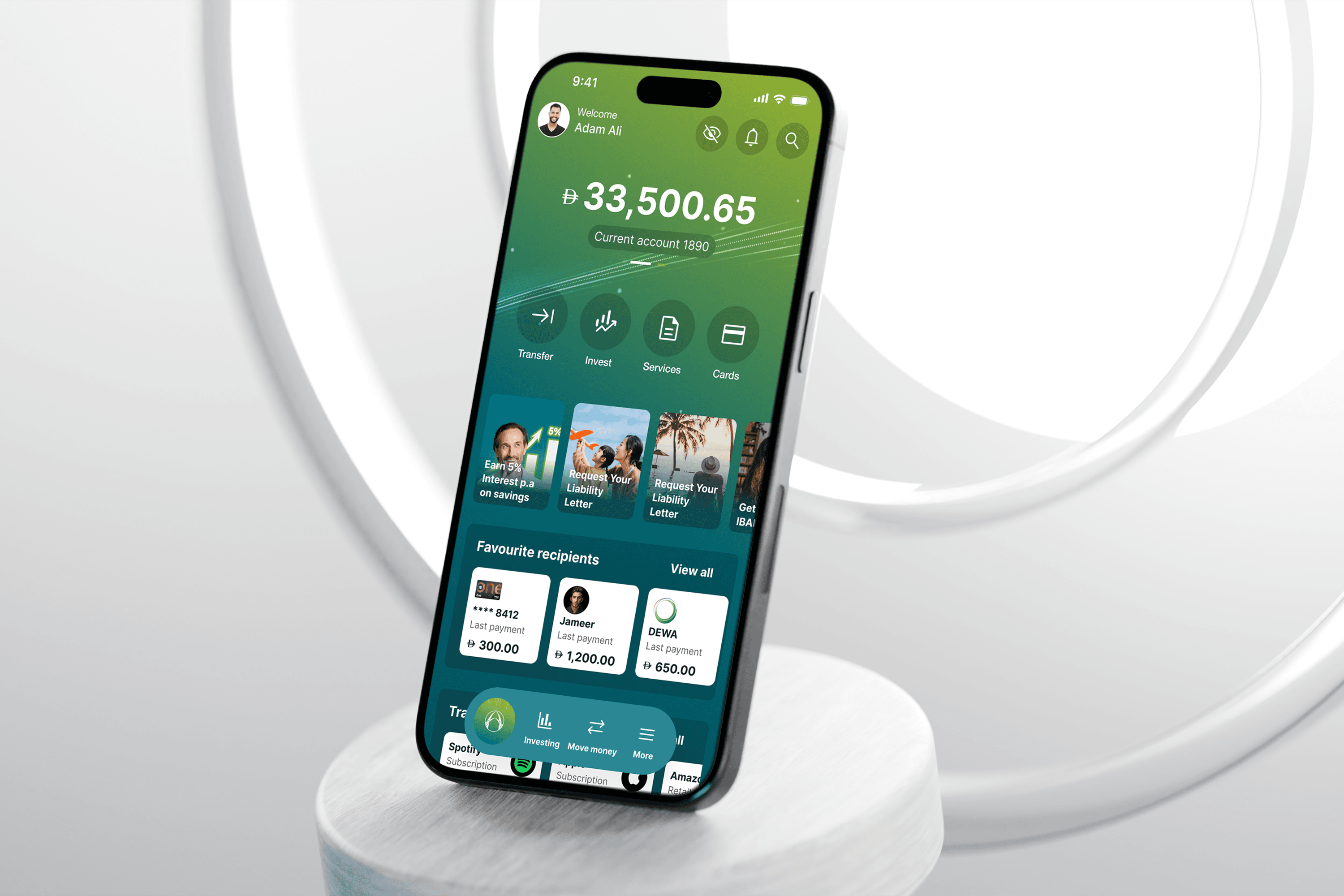
Designing a simpler, more intuitive mobile banking experience
Client: Commercial Bank of Dubai
Industry: Banking / Fintech
Timeline: 8 months (2025)
My Role: Digital Product Designer, Payments and Transfer Lead
CBD’s mobile app needed a complete redesign to match the bank’s reputation for innovation. Our challenge was to modernise the visual language and simplify complex user journeys while keeping it usable for a diverse customer base.
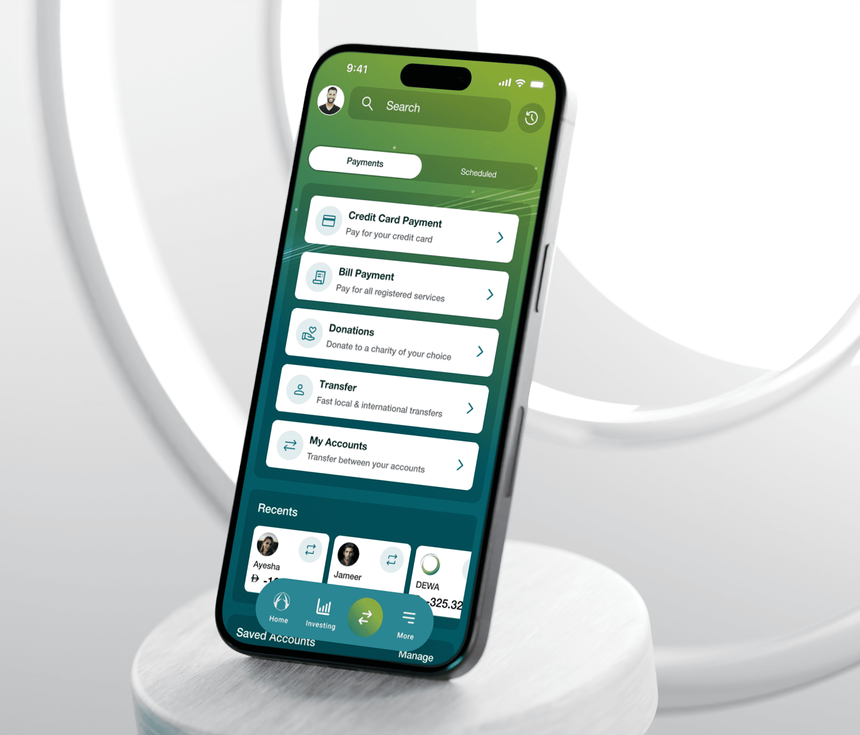
Making everyday banking simpler
CBD’s existing mobile experience needed a significant UX and visual refresh. Our goal was to make everyday banking tasks faster, clearer and easier to navigate, without overwhelming users.
Through user interviews with CBD’s existing user base, we explored how people interacted with the current app, uncovering specific pain points, behaviours and priorities that helped shape our approach.
How can we make a complex banking app feel more modern and intuitive without removing the key functionality users need?
Early Testing
I worked with the team to develop low-fidelity wireframes and working prototypes, which we tested with users through task-based testing and heatmaps.
For the homepage, we tested two different approaches to understand which structure better matched users’ mental models.

We then tested both approaches to understand which structure better matched users’ mental models. Direction A created a more guided experience, with a 58.8% success rate and lower time on task. Heatmaps also showed users were able to find the intended interactive areas more consistently.
Innovating Visuals
As part of the project, we were tasked with transforming CBD’s visual language to create a more modern and engaging app experience. We began by developing multiple visual directions, exploring how colour, UI, illustration and imagery could work together.
Through early user research, we gained a better understanding of CBD’s target audience and the banking apps they already interacted with. This helped us understand what users were familiar with and where we could push the visual direction to make CBD feel more modern, while still feeling clear and trustworthy.
We presented the four directions to stakeholders before narrowing them down to two routes, which we developed further and tested with existing users.
We then developed the two selected routes into high-fidelity prototypes and tested the same journeys again.
This gave us a useful second layer of validation:
Does the visual direction support the user experience?
We could see how real users responded to each approach when interacting with it, not just by looking at a moodboard.

Redesigning the journeys people rely on most
Alongside the wider app redesign, I led the redesign of Payments & Transfers.
We evaluated the existing journeys and identified where users were struggling, then redesigned the flows and tested them repeatedly. We evaluated the existing journeys and identified where users were struggling, then redesigned the flows and tested them repeatedly.
Through three rounds of testing and iteration, we progressively refined the payment journeys, moving from the original CBD experience to a simpler, more focused solution.


A clearer banking experience, validated by users
The final direction brought together the UX and visual work into a more modern, consistent banking experience.
The redesign simplified key payment and transfer journeys while introducing a refreshed visual language, illustration style and interaction patterns.
Reflection
Test early. Low-fidelity testing helped us solve structural problems before investing in polished UI.
Reduce, don’t just add. The strongest improvements often came from removing unnecessary decisions and making the important actions obvious.
Visual design is part of UX. Hierarchy, colour, iconography and illustrations all influenced how confidently users navigated the product.