Commercial Bank of Dubai
Commercial Bank of Dubai (CBD) is one of the UAE’s leading financial institutions. Working as part of the design team at Omnia, I led the redesign of CBD’s payment and transfer flows while contributing to the overall visual direction.
Product Design
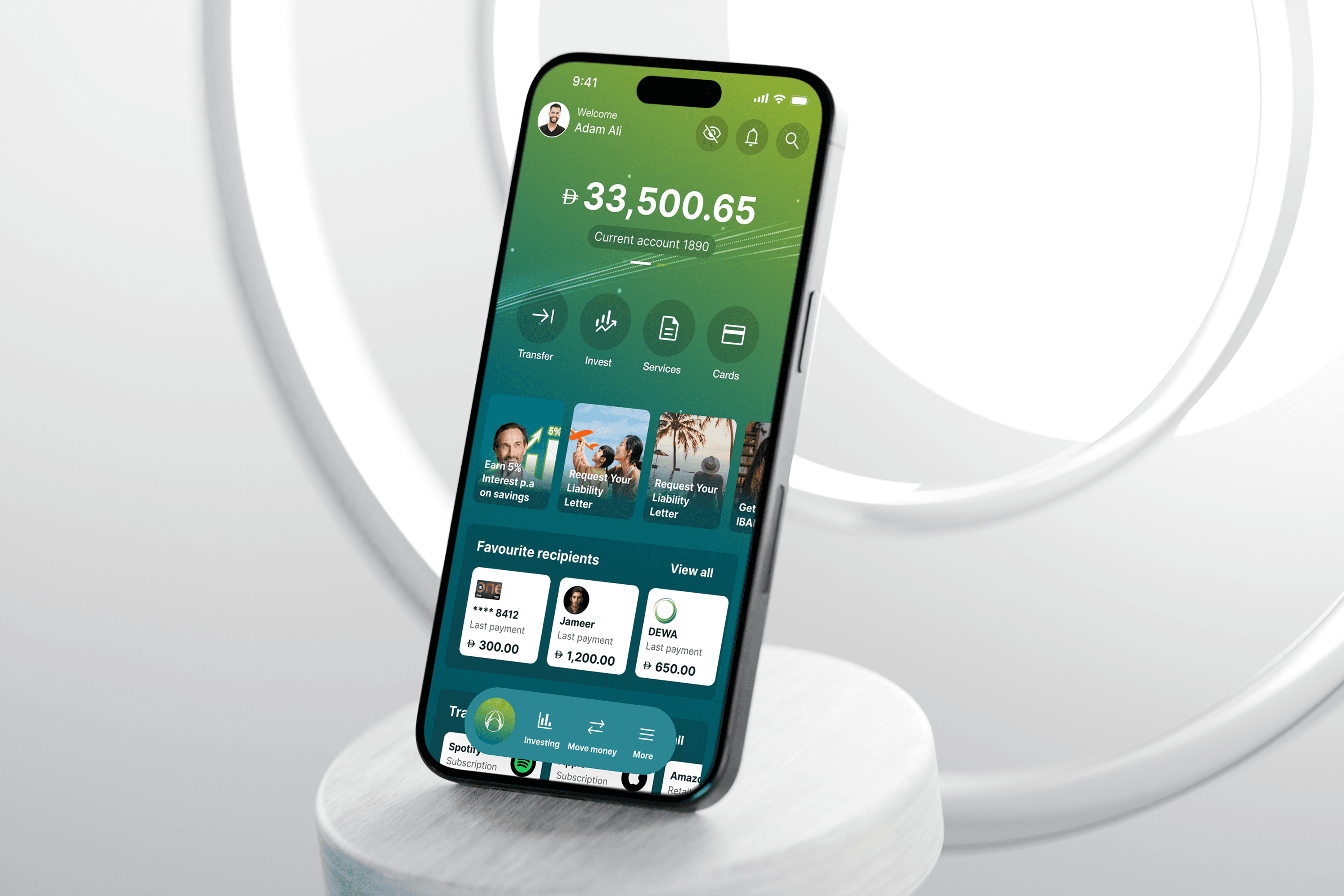
Designing a simpler, more intuitive mobile banking experience
Client: Commercial Bank of Dubai
Industry: Banking / Fintech
Timeline: 8 months (2025)
My Role: Digital Product Designer, Payments and Transfer Lead
CBD’s mobile app needed a complete redesign to match the bank’s reputation for innovation. Our challenge was to modernise the visual language and simplify complex user journeys while keeping it usable for a diverse customer base.
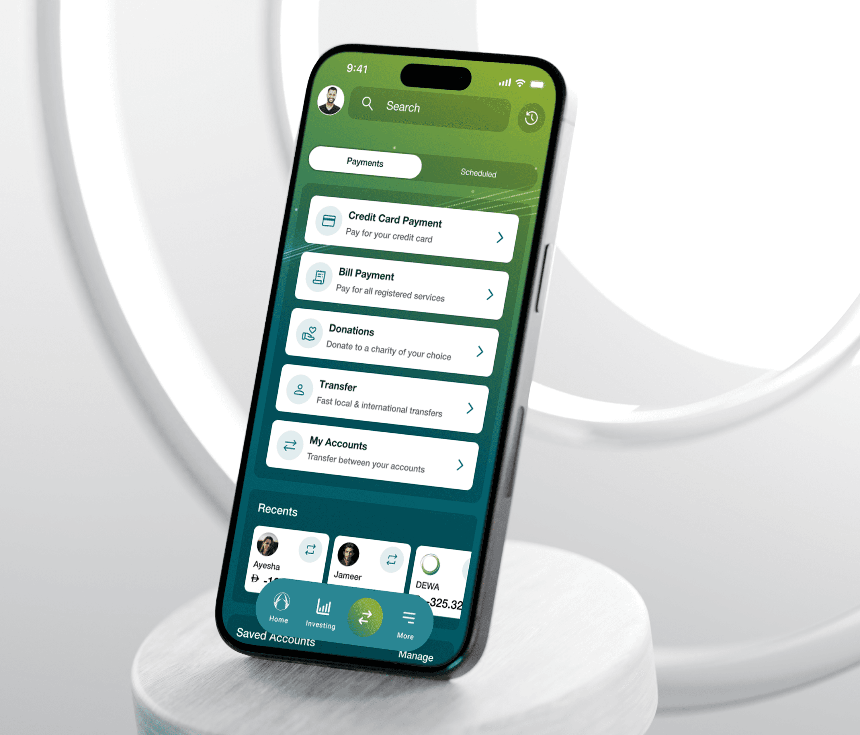
A modern banking experience, without the added complexity
Commercial Bank of Dubai wanted to modernise its mobile app to make everyday banking faster and more intuitive.
Through user interviews and stakeholder workshops, we identified a need to balance a contemporary look and feel with the clarity, functionality and trust customers expected.
Understanding users' motivations and frustrations with the current application gave us a starting point that shaped our designs.
Finding the gaps
Alongside user and stakeholder interviews, we audited the existing app against WCAG accessibility guidelines and benchmarked competitor banking experiences.
This helped us identify usability issues and opportunities to modernise the experience without compromising functionality or trust.

Test early. Iterate often. Build a foundation.
We translated our research into low-fidelity wireframes and prototypes, testing key journeys with users before committing to a visual direction. This helped us validate navigation, identify friction and establish a foundation for the wider application.
We tested two homepage concepts and Login journeys to understand how users preferred to navigate the app: a focused dashboard prioritising essential actions, and a richer experience offering more content and opportunities for discovery.

Testing assumptions, uncovering insights
Using task-based testing and heatmaps, we evaluated how effectively each concept supported key tasks.

Testing showed that the focused layout helped users navigate tasks more easily. However, the familiarity of the Stories feature highlighted an opportunity to retain it to support feature discovery.
Building a foundation
As design exploration progressed, we established a low-fidelity design system to create consistency across the application, streamline iteration and provide a scalable foundation for rollout once the visual direction was defined.
Exploring what modern banking could look like
With the core user experience taking shape, we explored different visual directions to modernise CBD’s visual language while maintaining the clarity and trust expected from a banking app.
We developed three initial directions, exploring different combinations of colour, imagery, illustration and UI patterns.


From visual exploration to a shared direction
We presented the visual routes to stakeholders to evaluate how well each direction aligned with CBD’s ambition to deliver a more modern banking experience.
Through discussions and feedback, it became clear that the first route felt too close to the existing application. Stakeholders wanted a bolder, more innovative departure from the current visual identity.
We used this feedback to narrow the options from three routes to two, taking the more vibrant and premium directions forward for further exploration and user validation.
Testing first impressions with real users
With two directions shortlisted, we used Maze to gather initial feedback from existing users.
We explored how users responded to each visual approach, capturing their impressions of the colour, imagery and overall look and feel. This helped us understand whether the concepts felt modern, trustworthy and appropriate for a banking experience.

Both directions generated positive initial reactions, but communicated different qualities. We took these insights into the next stage of testing to evaluate how each direction worked within a real product experience.
From first impressions to real interactions
We then developed the two selected routes into high-fidelity prototypes and tested the same journeys again.
This gave us a useful second layer of validation:
Does the visual direction support the user experience?
We could see how real users responded to each approach when interacting with it, not just by looking at a moodboard.

The findings helped inform the final visual direction before we moved into wider design implementation.
Designing for flexibility
As stakeholder feedback evolved, the final visual direction took time to decide.
This created a challenge: we needed to keep progressing the high-fidelity designs without committing too early to a visual approach that might change.
To support this, we developed a robust, customisable design system using reusable components and design variables. This allowed us to continue refining key journeys while keeping the interface flexible.
Once the final direction was agreed, we could apply the chosen visual styling more consistently across the application, reducing the need to rework individual screens.

Redesigning the journeys people rely on most
Alongside the wider app redesign, I led the redesign of the Payments & Transfers journeys.
I audited the existing flows, identified usability issues and worked through wireframes and prototypes to simplify key tasks. Through iterative testing, we refined the journeys to make important information easier to find and everyday banking actions more straightforward to complete.
Audit

Map the journey

Wireframe

Test

A clearer banking experience, built around users
Once the visual direction was chosen we rolled out the screens using our existing design system, testing the new high fidelity flows to ensure the final direction


A clearer banking experience, validated by users
The final direction brought together the UX and visual work into a more modern, consistent banking experience.
The redesign simplified key payment and transfer journeys while introducing a refreshed visual language, illustration style and interaction patterns.

Reflection
Test early. Low-fidelity testing helped us identify structural issues and validate solutions before investing in high-fidelity design.
Simplify with purpose. The strongest improvements often came from removing unnecessary complexity and making essential actions easier to find.
Visual design is part of UX. Hierarchy, colour, iconography and illustration all influenced how users understood and navigated the experience.